
QT Care Health
Connecting LGBTQ+ folks with affirming healthcare providers who understand their unique needs.
The Challenge
For many LGBTQ+ individuals and families, finding healthcare providers who offer truly inclusive, affirming care remains a significant challenge. Despite growing awareness, many still face discrimination, misunderstanding, or simply a lack of culturally competent care when seeking medical services.
Our research revealed several key pain points:
56% of LGBTQ+ patients reported negative experiences that made them delay seeking necessary care
LGBTQ+ users encounter unexpected bias during appointments
Privacy concerns prevented many from openly asking for recommendations in their networks
What’s my role in all of this?

As an early-stage startup, I've worn many hats to bring QT Care Health to life:
Led end-to-end product design and branding, from wireframes to scalable, high-fidelity prototypes
Conducted user research with diverse LGBTQ+ community members
Shaped product strategy based on real user pain points
Collaborated with developers and our legal team to ensure that our designs are feasible and follow healthcare legal requirements
Facilitated user testing sessions to refine our approach
This work is personal. As a queer person who's spent countless hours searching for affirming providers, faced awkward questions in waiting rooms, and started over with new doctors too many times, I understand these challenges firsthand. I've been able to tap into diverse queer networks to understand varied healthcare experiences and needs beyond my own.
This community connection helps ensure our platform serves everyone—from users seeking gender-affirming care, to families trying to conceive.
Defining our strategy
Design without direction is just decoration. That's why I weave strategy into every step of my process. I help our team set clear goals and make decisions that serve both users and our mission.
I ask the hard questions: Who are we really serving? What problem are we actually solving? How will we know we've succeeded? Good strategy turns good design into real impact—and that's ultimately what matters most.
Understanding the laws while designing
Healthcare regulations required careful consideration from the start. Rather than waiting until final designs, I collaborated with our legal team early to ensure compliance. I reframed these requirements as user protection features like clear consent flows, transparent data policies, and secure but usable interfaces.
Good design and good governance go hand in hand.
Designing to help our users
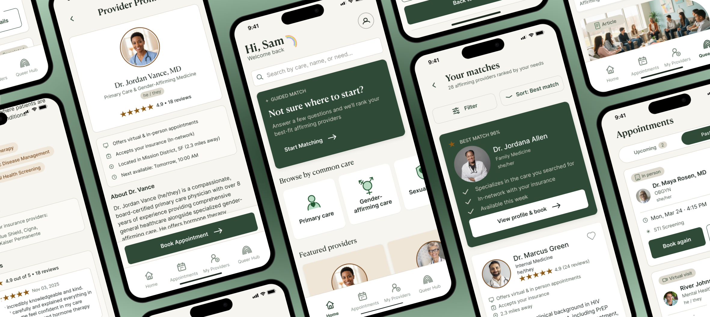
1) Provider vetting - designing for transparency & trust
I designed visible badges and detailed vetting process descriptions because trust drives retention in healthcare.
While other platforms don't disclose their vetting methods, I made transparency a core design principle. We vet physicians for cultural, sexual, and gender competency and clearly communicate this process to users, connecting them with affirming doctors while ensuring healthcare free from bias and discrimination.
2) Primary & advanced filtering
A 6-question intake gets users to matched provider results fast. From there, an advanced filter panel lets them refine by provider identity, care model, and logistics to find the right fit.
3) Inclusive language and discreet booking
Research showed LGBTQ+ users needed both to be seen accurately and to stay safe. I added preferred name and pronoun fields so providers address patients correctly from the first contact, and an optional discreet communication setting where providers omit their name, practice, and specialty from calls, texts, and emails.
4) QT Care support and community reviews
Users can rate and review providers after each visit, and report a problem directly to QT Care staff. Reviews are visible on provider profiles so patients can see how others in the community were actually treated before booking.
5) Effortless appointment tracking
Users get a clear confirmation with all visit details right after booking, plus an at-a-glance view of upcoming and past appointments they can revisit, manage, or rebook from anytime.
6) Queer Hub
A searchable, filterable library of articles, podcasts, blogs, and videos on LGBTQ+ health and wellness. Built so users can find trustworthy information in one place and see that QT Care supports them beyond just booking an appointment.
What did my research tell us?
Numbers tell stories, but people reveal truths.
My research combined academic depth with real human stories. I read A LOT of scholarly articles to understand healthcare barriers, but the real insights came from conversations with people navigating these challenges daily. I designed surveys that asked the right questions and created interview spaces where people felt safe sharing difficult experiences.
Snapshot of research
While my can’t share specifics, I can tell you that patterns emerged: healthcare journeys filled with unnecessary detours, small victories celebrated like marathons won, and workarounds that shouldn't have to exist. These stories weren't just data points—they became our compass, guiding every design decision toward solutions that actually matter.
Where my design started
Initial sketches
From scribbles to solutions—this is where research meets reality. My design process began with quick sketches to explore ideas without getting caught in details too early. These rough concepts evolved through feedback and testing into increasingly refined prototypes.
Refining based on feedback
Each iteration solved a specific challenge: How might we communicate provider competencies clearly? What's are the most important search features? Is our design scope feasible?
Being realistic
This is an example of how strategy and design intersect: after talks with stakeholders, we decided to scrap an entire function: community forum. We have it pinned to revisit later once we have enough users to support that feature.
Systems thinking for growth
After validating our flows in mid-fidelity testing, I built out our design system: an atomic component library, a two-tiered token system with semantic and primitive variables, and a style guide to document it all. The token structure keeps design and engineering in sync, and the system as a whole lets us iterate fast now and scale as the team and product grow.
Addressing abandonment rates
User testing showed an 18.1% drop-off during intake, caused by a 12-question flow that mixed essential filters with softer preferences upfront. I separated the two: 6 essential questions (care type, location, insurance) to reach results faster, with preference-based filters (identity, care approach, specialty) moved to an advanced filter on the results screen instead. Drop-off fell to 9.8%, then dropped a further 35% once users could refine matches after seeing them.
A peek at what user testing told us & how I implemented it:
What next?

We're building momentum behind the scenes! While our digital foundation takes shape, we're focusing on growing our provider network—having meaningful conversations with physicians who share our vision for inclusive healthcare. We're fine-tuning features based on early feedback and scaling our infrastructure to support communities nationwide. Our calendar is marked for launch next year, but the real journey begins after that. This is more than just an app release—it's the start of a movement to transform healthcare experiences for our community.
